work


LANGOS BAR
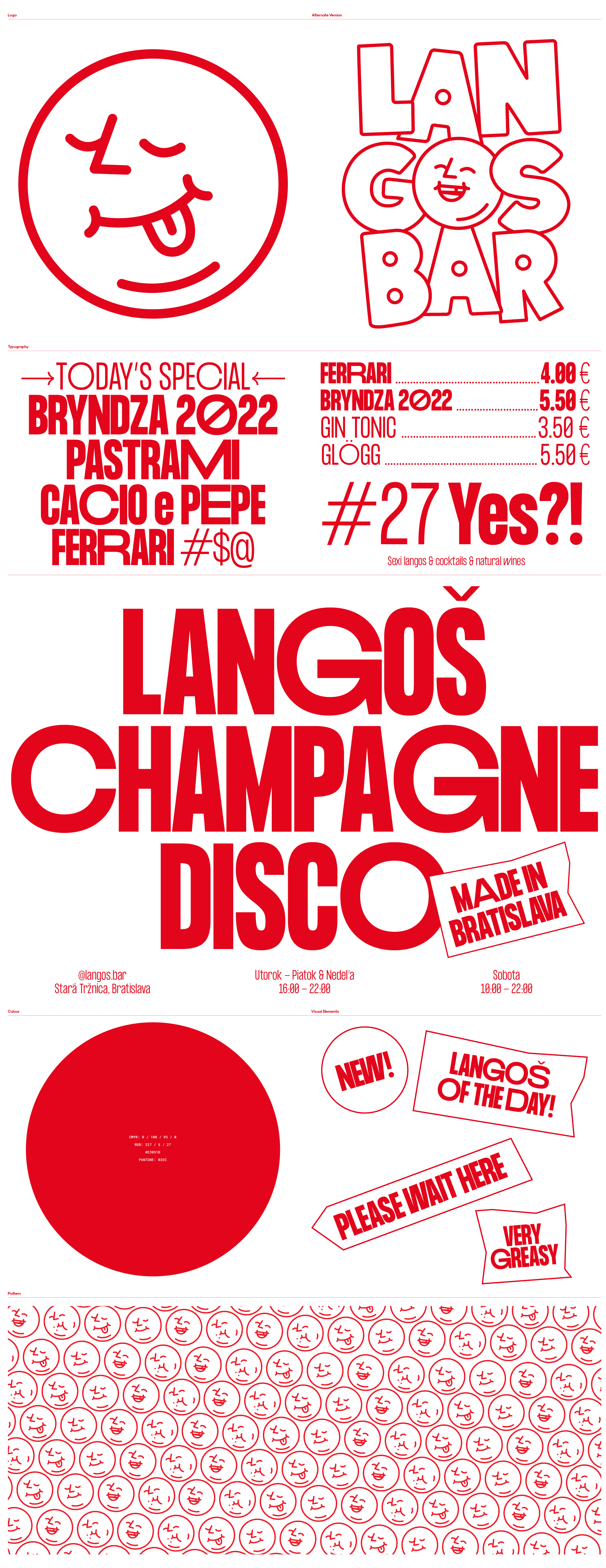
Our approach was to create a visually strong and bold identity that can reinterpret this modern concept, but at the same time keeping the character of the concept authentic and easy to understand. We wanted to express the pleasure that eating langoš brings. We teamed up with artist Tomáš Rybár aka Sicknico to create a character that can represent these emotions. We create a fat & happy face (being honest – langoš is not one of the healthiest, but for sure it is one of the most satisfying types of food). This face offers quite modular options and can express different emotions. In the end, we decided to use only the face version of the logo, because it has stronger expression the "logotype" version. We wanted to keep the colour palette very simple and the only colour that is allowed to use is red which create enough accent. The modularity of the logo reflects within the typography as well. We choose a typeface that has different glyphs variations that allow us to work with the text more flexible.