work


NUDA Bar
NUDA bar
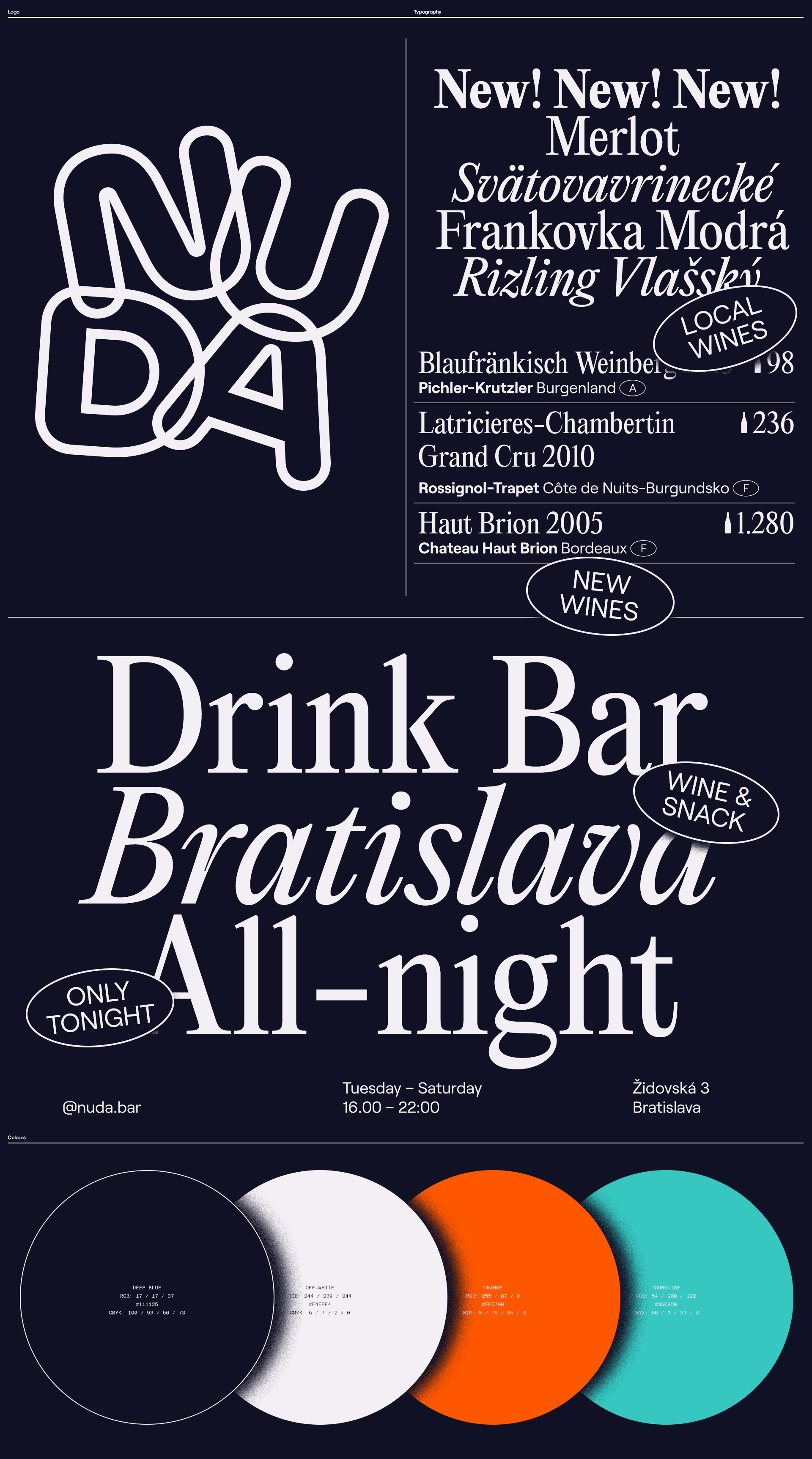
The concept of being anything but boring had to be translated into the visual identity as well. This was reflected in the character of the logotype. Each letter is in a different angle – the composition of the logotype is always random which creates modular/dancing symbol. To tone down the overall impression of the identity the typography is more mature. The colour palette is referring the materials used in the interior.
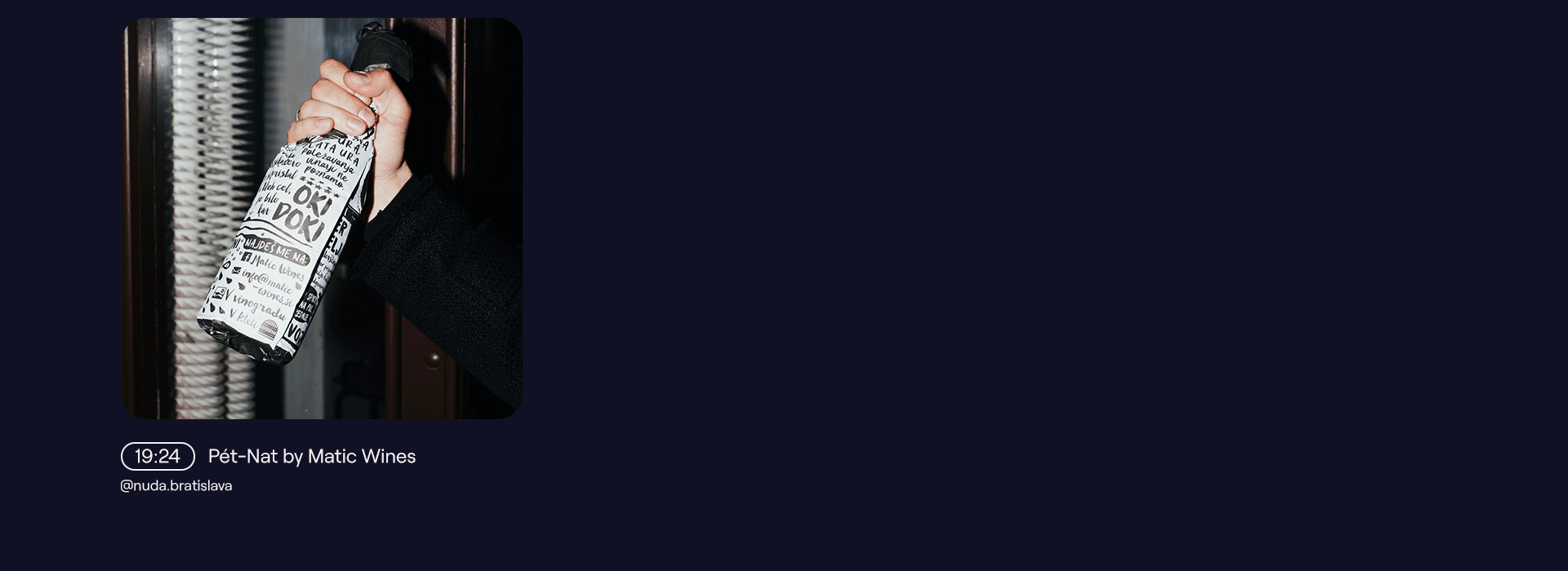
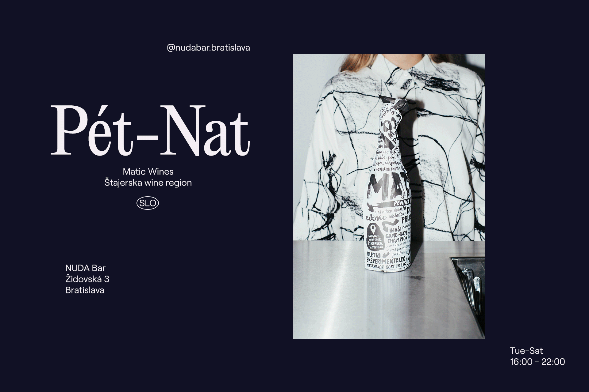
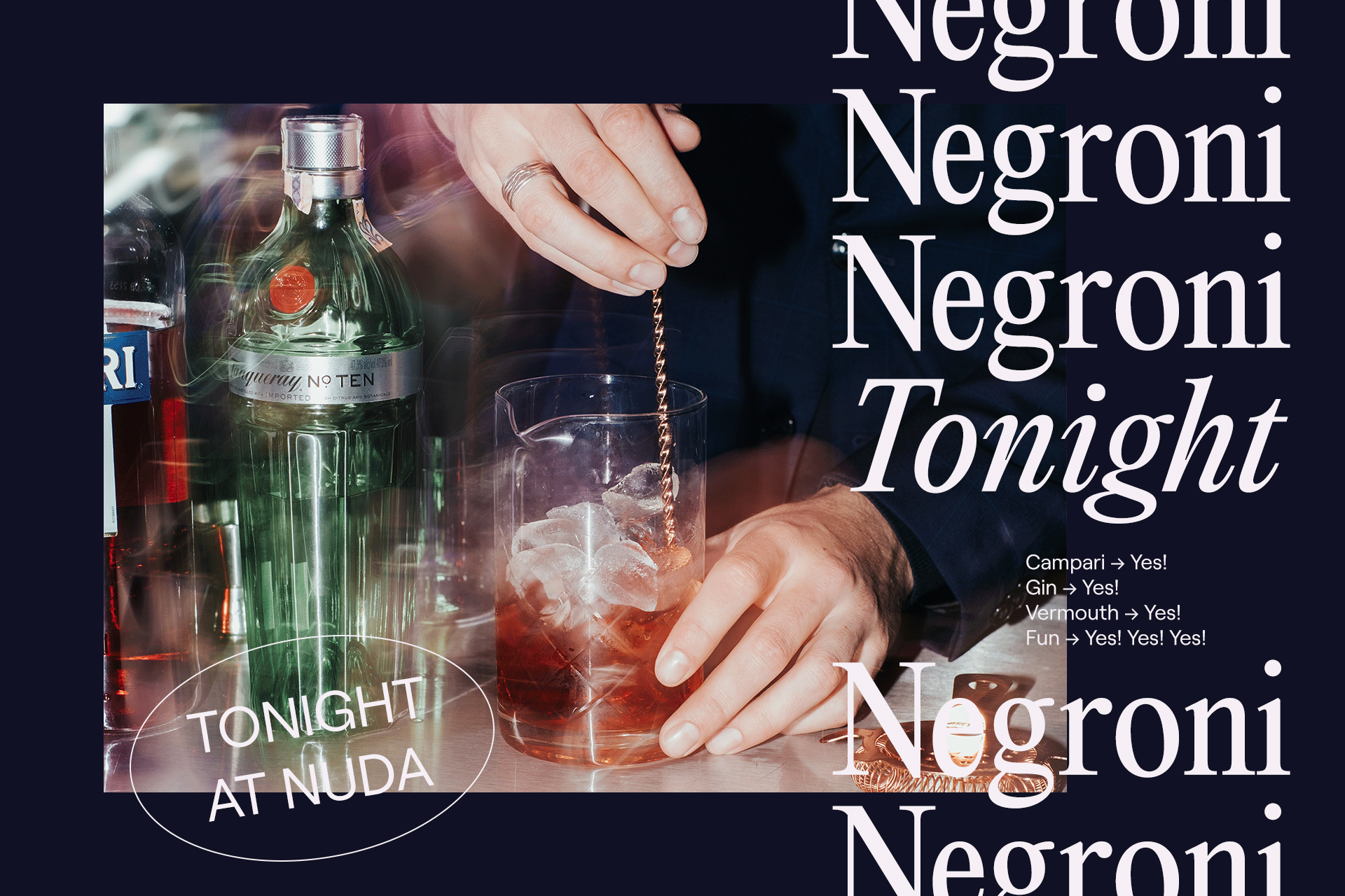
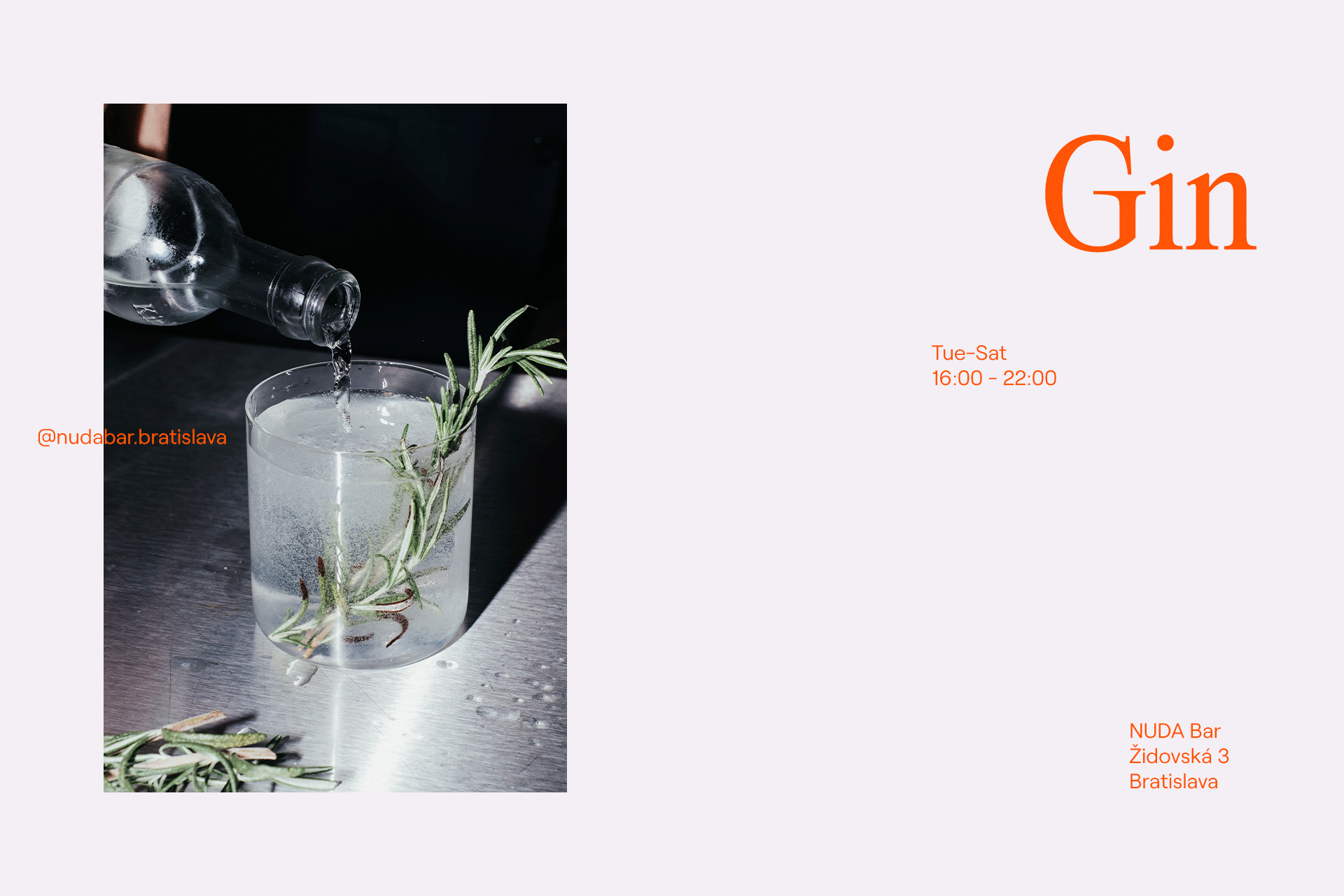
The photo direction of the communication is based on the concept of having fun while drinking quality drinks. The photo style is a combination of raw & sharp techniques with blurry & long exposure techniques. The communication is genuine with honest emotions. The blurry images are referring to the feeling of having blurred vision after a couple of drinks – and as the night progress, the images are blurred more and more.